Background
I worked within a group on two main sections of Kingston’s new web tools, which will be implemented in their new Live Work tourism website. The new Kingston Live Work site will act as Kingston’s hub for people looking to visit and live in Kingston. My team focused on the information architecture (IA) of the website and the UX of the cost-of-living tool. We did this by conducting a literature review, competitive scan, usability tests, and developed a prototype for final recommendations. The original website scored an NPS rating of 7.69, where my prototype scored 83.33.
Results page
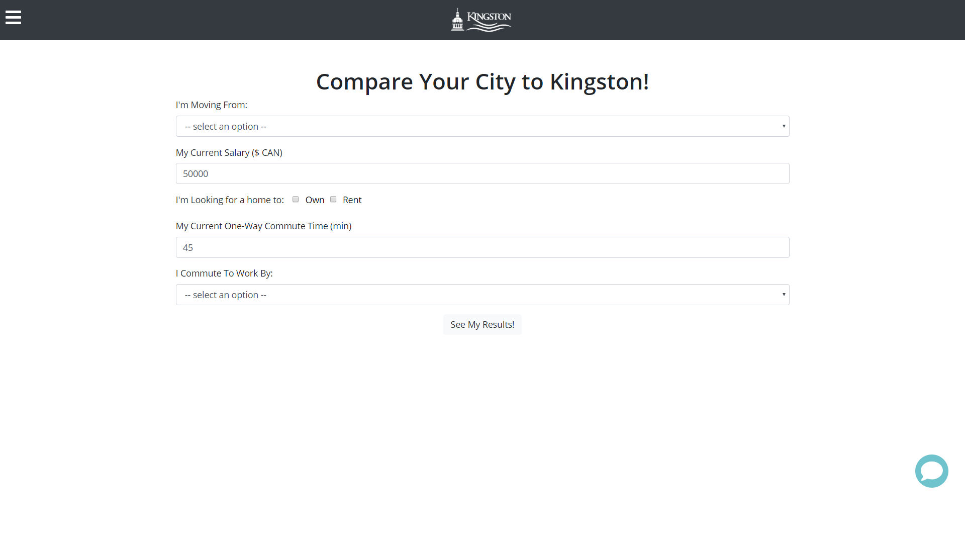
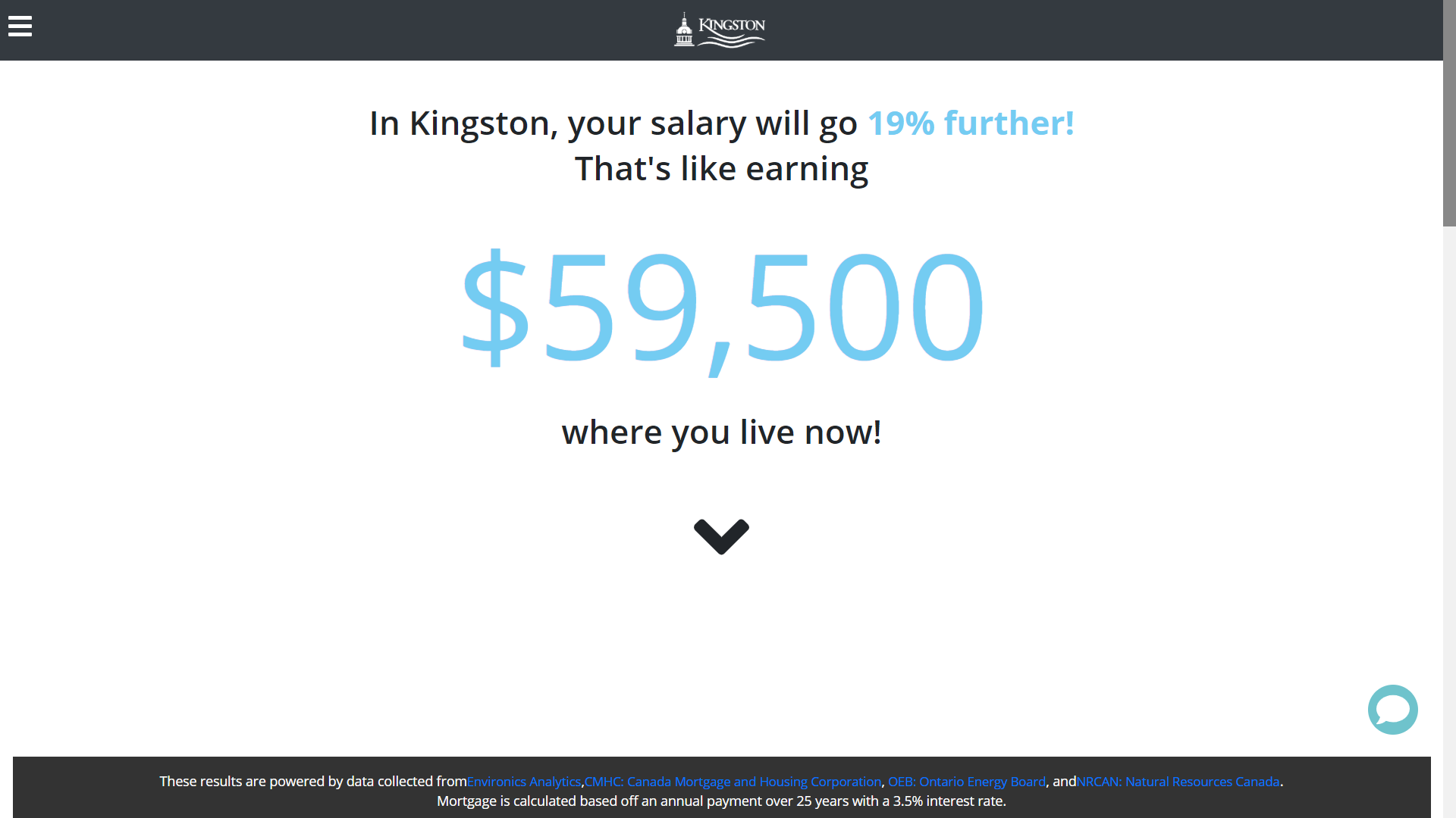
Cost of living calculator
Initial Tools
This is a desktop website that has a video on the landing page with the six tools behind a hamburger menu. The cost of living tool brings you to a page to input information and submit it to get to the results page. The results page shows how much you would make in Kingston then breaks it down once you scroll. At the bottom of the page, there is a button to go back and compare a different city.
Research
The purpose of this study is to evaluate the existing information architecture and the Cost of Living tool of the Talent Attraction Hub. This will be done by conducting various research methods in order to improve the usability and structure of the website to better serve the three (3) outlined personas.
Research Questions
Does the Talent Attraction Hub and Cost of Living tool follow best practices?
Do the labels make sense to the user?
How should we validate recommendations?
What are the user impressions of the Talent Attraction Hub?
How can we make all of the Talent Attraction Hub tools function together?
How do we organize the data to show the results/message efficiently?
How can we optimize the Talent Attraction Hub?
What are the major issues with the Talent Attraction Hub and Cost of Living tool?
What do other cities do to attract residents?
Are there existing tools like the Cost of Living tool already?
Methods
Literature Review
Competitive Scan
Heuristics evaluation
Accessibility Check
Usability Tests
Tree Test
Findings
Literature Review
We learned that a matrix information architecture would be the best because the users can jump from page to page. We also identified the best practices for content strategy, navigation, and labels.
Competitive Scan
In the competitive scan we compared websites with similar tools (BankRate, Expatistan, NerdWallet, etc) and websites with similar content (Toronto, Ottawa, Antlanta, Dallas, etc.)
We learned that our website should have great visual aesthetics with an accessible and consistent layout. The cost of living tool should have its results updated live, have charts to show data relation and have all relevant info on the first screen.
We learned that our website should have great visual aesthetics with an accessible and consistent layout. The cost of living tool should have its results updated live, have charts to show data relation and have all relevant info on the first screen.
Heuristics evaluation
Our heuristic evaluation was run on the cost-of-living calculator and we learned the following:
The error field doesn’t get highlighted to show where the error is
They don’t follow best practice for error display
There is no data limit
A drop-down only has three options
Accessibility Check
Personas
Urban Grads are single tech-savvy city dwellers with a pad in the clouds and a lively social scene on the ground. In their mid-twenties to early thirties, they are connected to the world through their smartphone.
Cars & Kids includes parents who are looking for events and experiences that collectively lead to a high quality of family life.
Experienced & Engaged are adults in their 40s, 50s, or 60s who are actively involved in life. They are well educated with interesting and high-paying jobs, allowing them to engage in a broad range of activities.
User Testing
Usability Test 1
Our first usability test was created to evaluate the information architecture of the entire site and the efficiency of the cost-of-living tool. We tested with 14 participants, who ranged across all targeted personas. The metrics we collected were:
Single ease questions
Pre & Post test questions
Time on Task
Completion Rate
Number of Clicks
Net Promoter Score
Test Highlights
Many participants had a hard time comparing another city once they were on the results page. The back button took them to the home page and the compare another city button was at the bottom of the page:
Cars & Kids Persona rated an easier time completing tasks than urban grads
Higher expected number of clicks overall
Much higher time on task overall
Very high completion rate
Only one task had a score above 6 for ease of use
7.69 Net Promoter Score
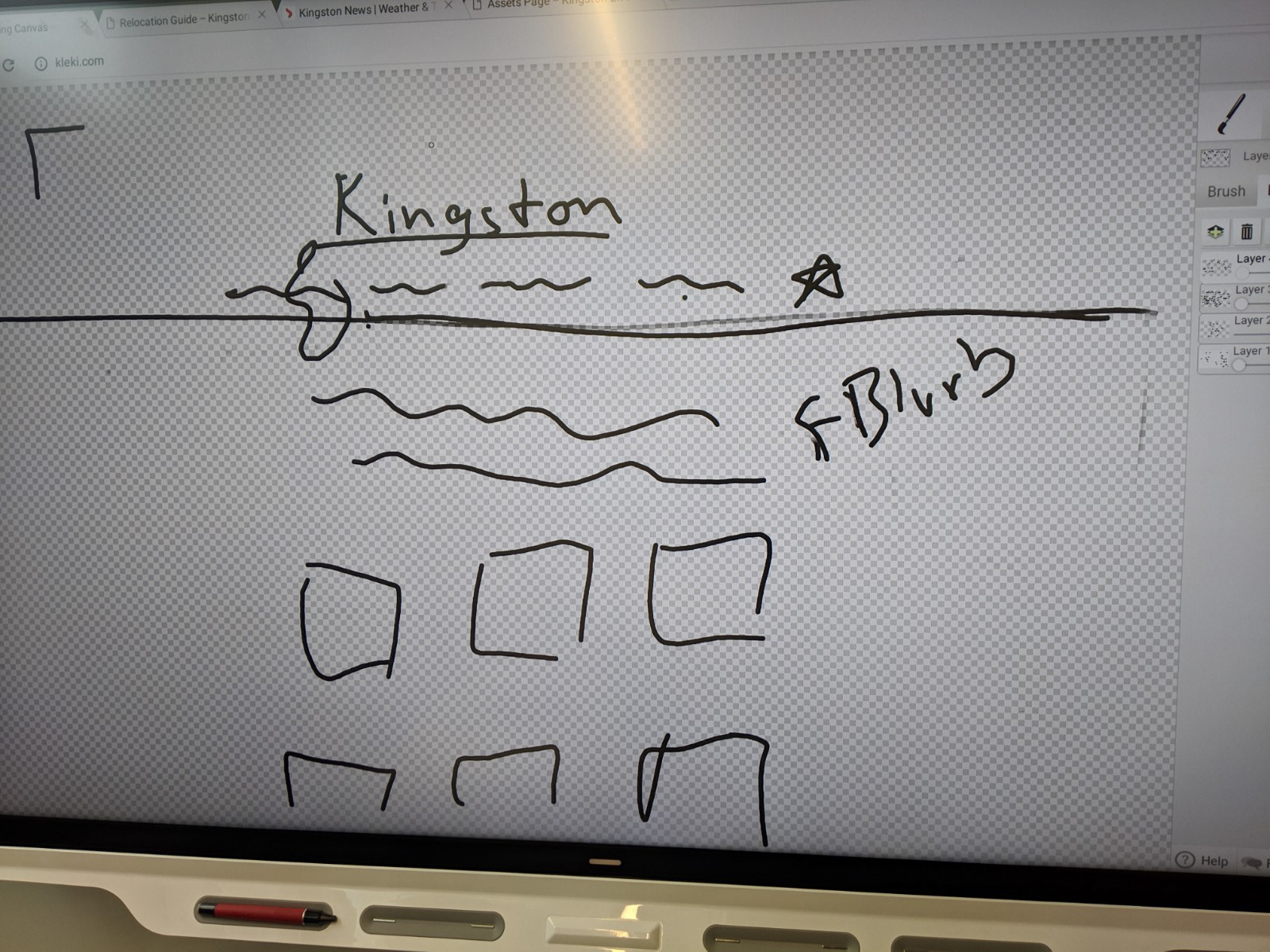
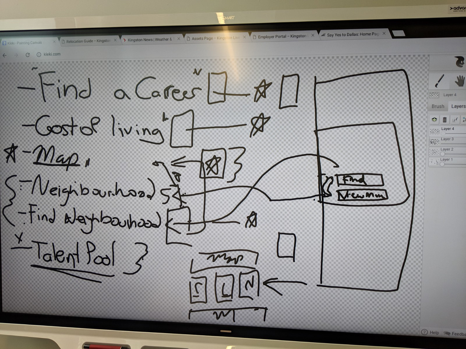
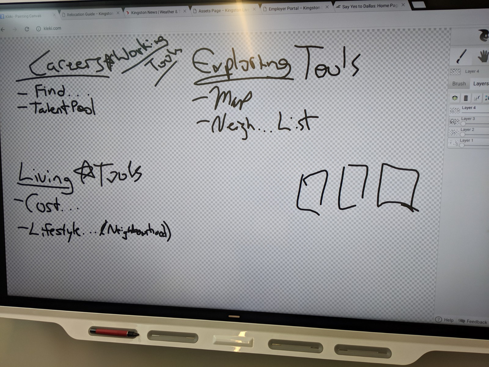
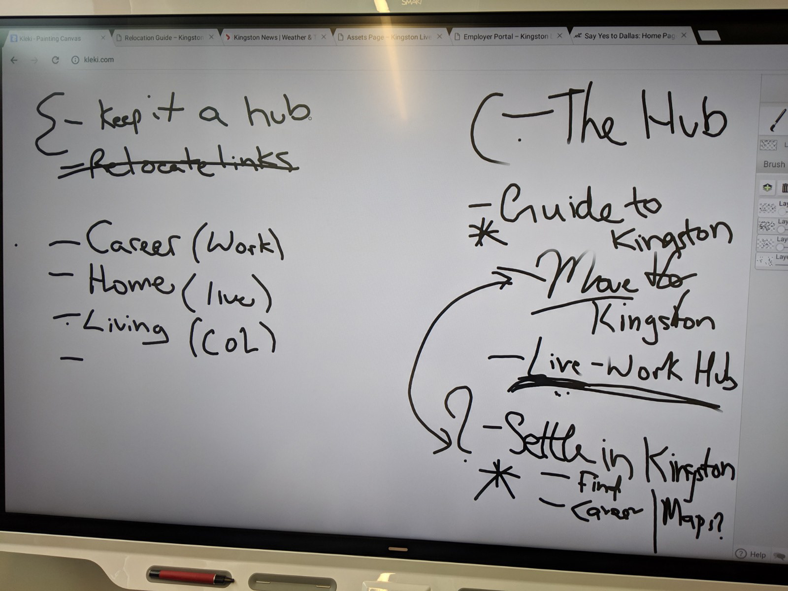
Initial Sketches
Prototype
From all of the research to date, I created a prototype that fixed all of the problems that came up and aligned with the suggested research.
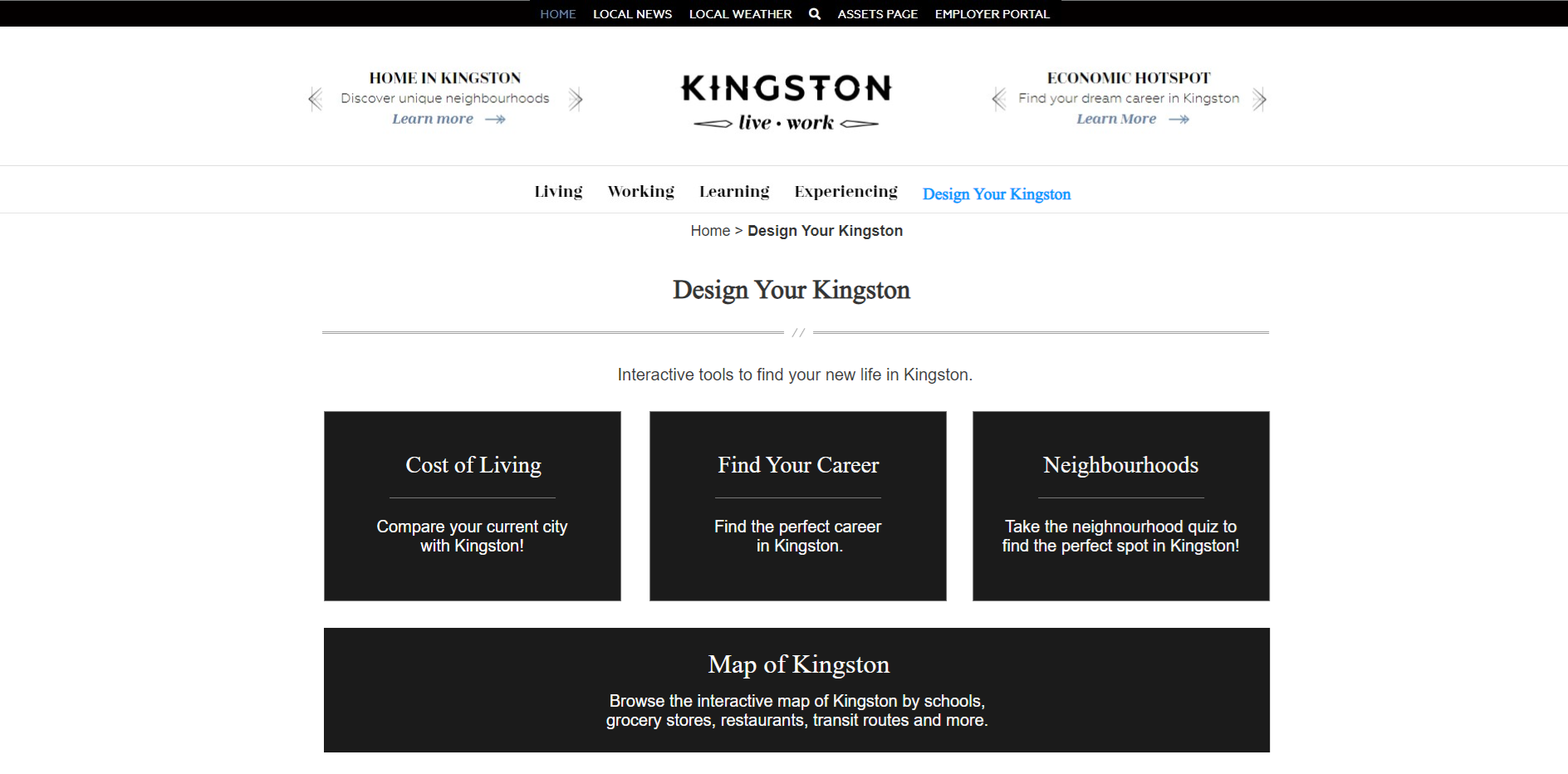
Landing Page
This landing page has all of the tools grouped together for easy access and separates the static pages from the interactive ones. The page was named “Design your Kingston” which is what we thought people would think of when we prompted them with interactive tools(this was not the case and was changed).
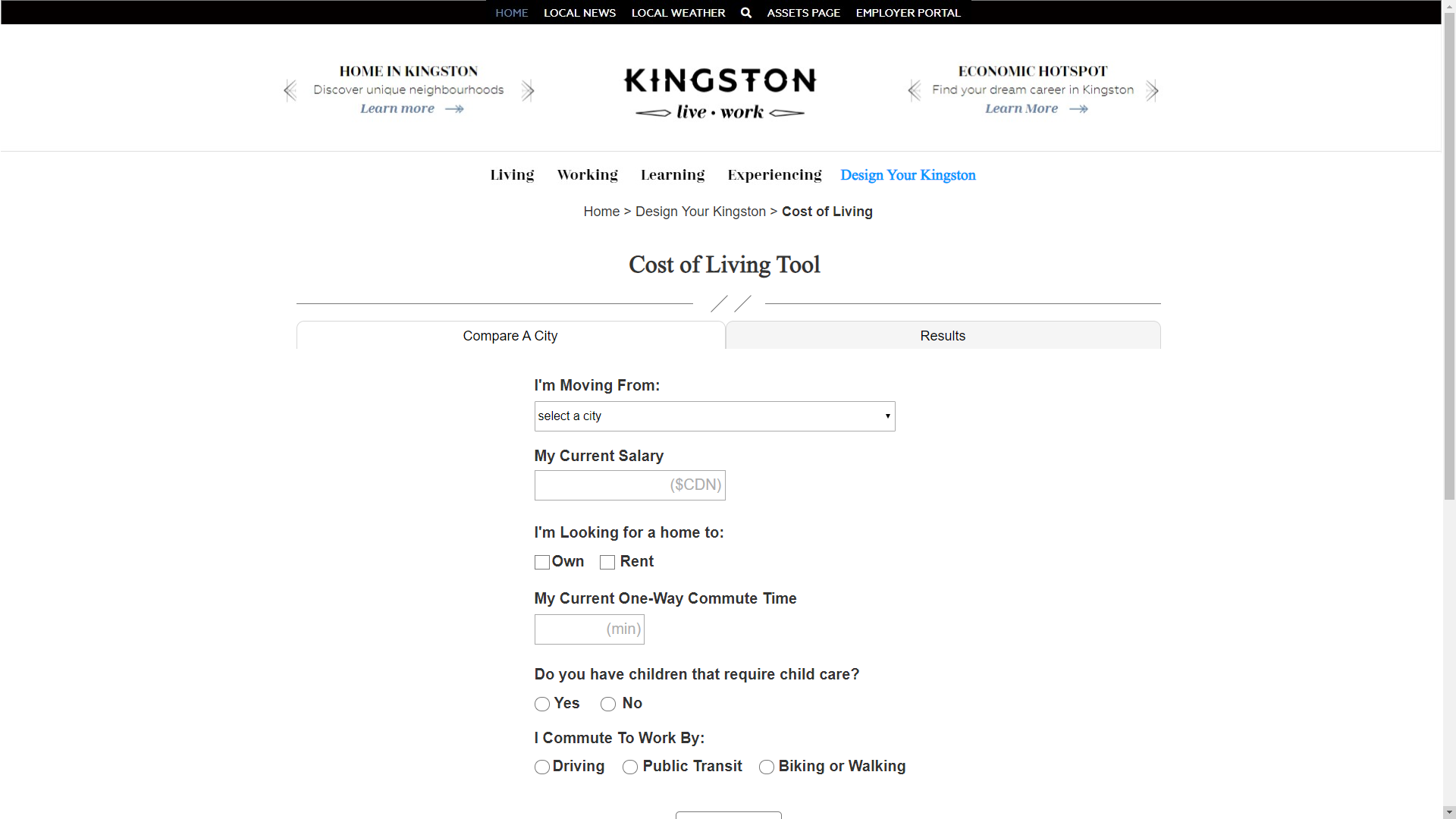
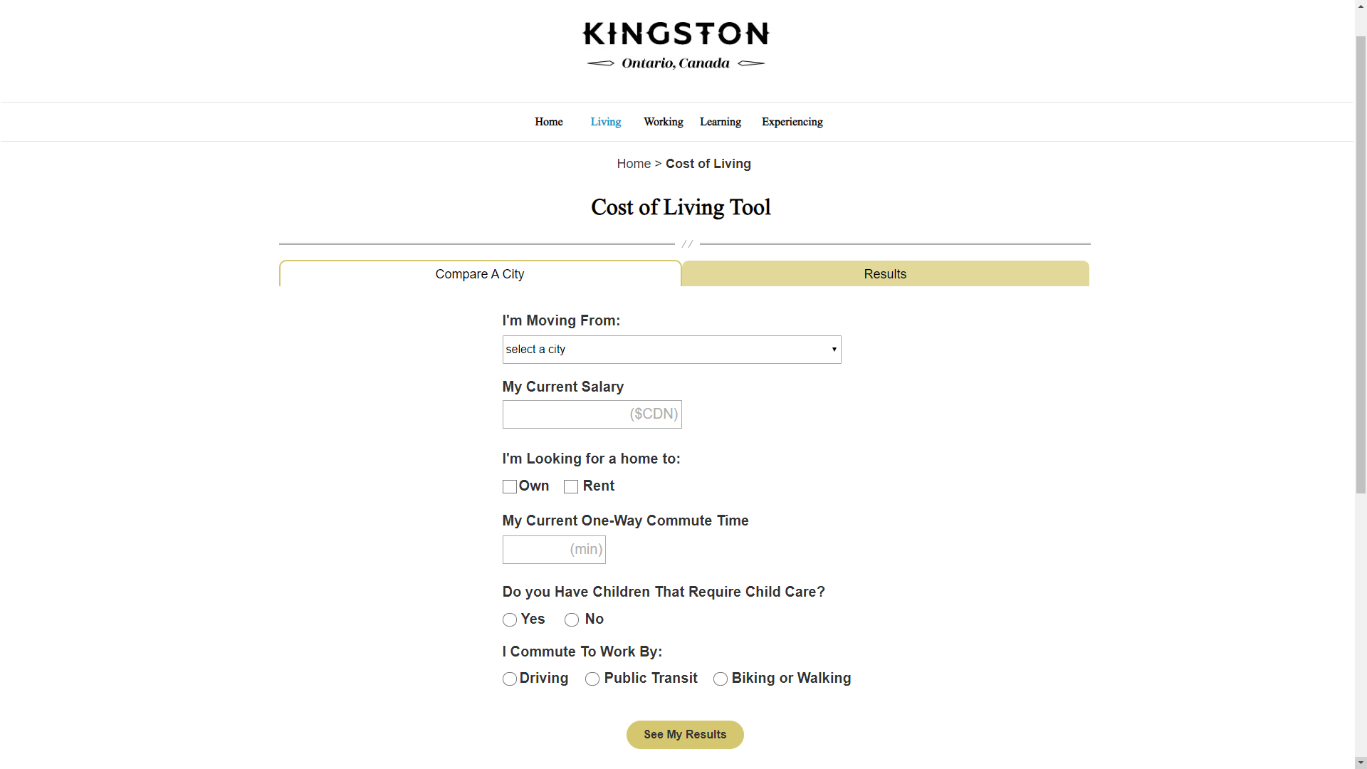
Cost of Living input page
The input page now works seamlessly with the results page for easier access between the two. The form fields and labels were adjusted based on best practices that we researched earlier during the literature review and heuristic evaluation.
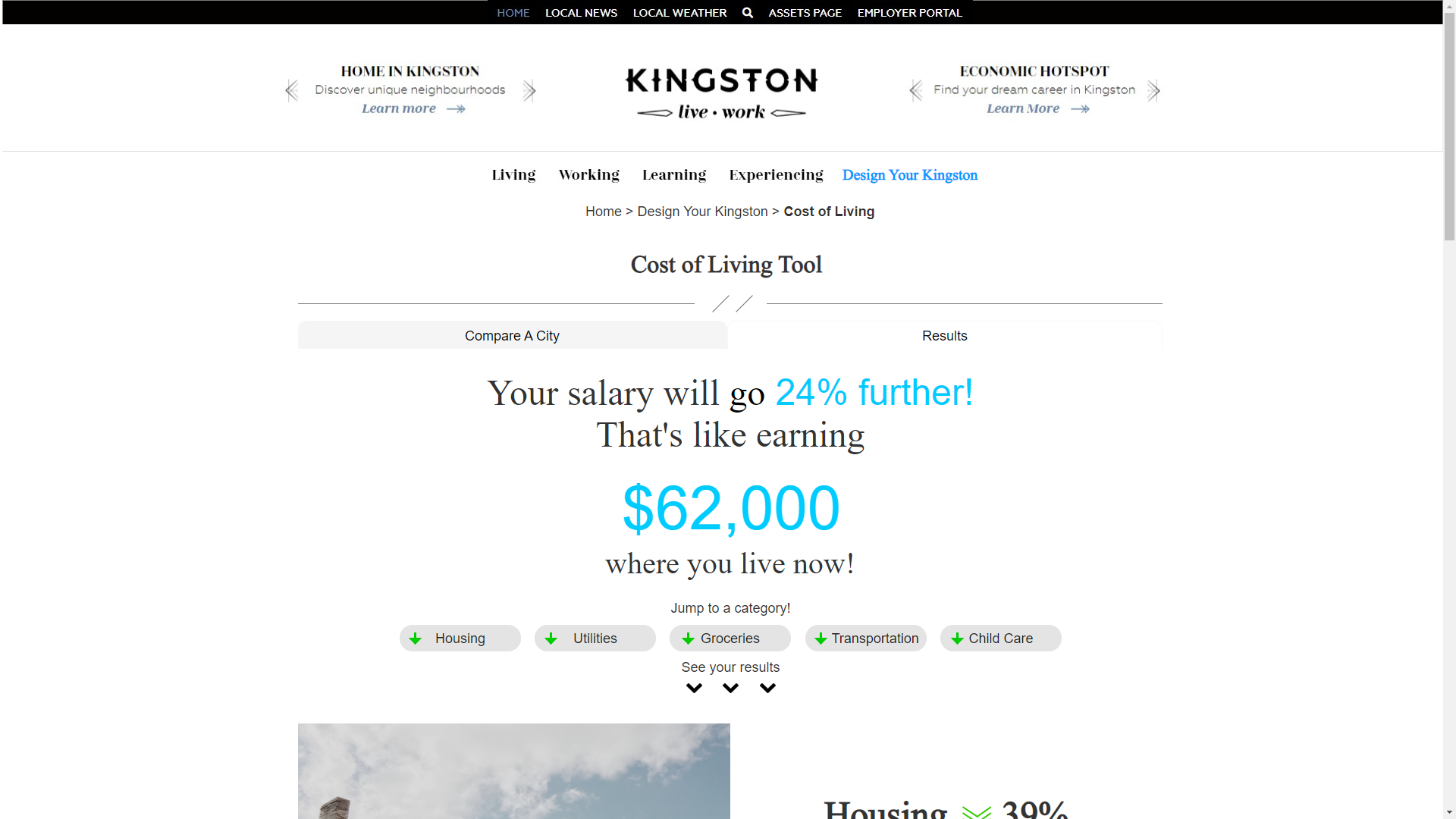
Cost of Living Results page
The results page shows all the comparisons on the first screen, which was a recommendation that came from the competitive analysis.
Prototype Findings
We used the same usability test and overall it was a huge success. The main findings were:
Higher ease of use rating (6+ SEQ overall)
Fewer clicks for each task
Lower time on task
Higher success rate for each task
Most notably, the net promoter score (NPS) rating went from 7.69 to 83.33
Tree test
One oversight we made was introducing the new main navigation tab “Design your Kingston” without testing it. So, we tested it in the final phase of the project with a tree test. We asked participants to navigate from the home page to the different tools. Our proposed solution was a failure as nobody went to that tab.
Solutions
Our proposed solution was an improved prototype with 5 main recommendations to be made based on all of the research done so far.
Group the tools and set them on the home page of the Live-Work site. This allows for all the tools to be in one place and to showcase them to new visitors of the site.
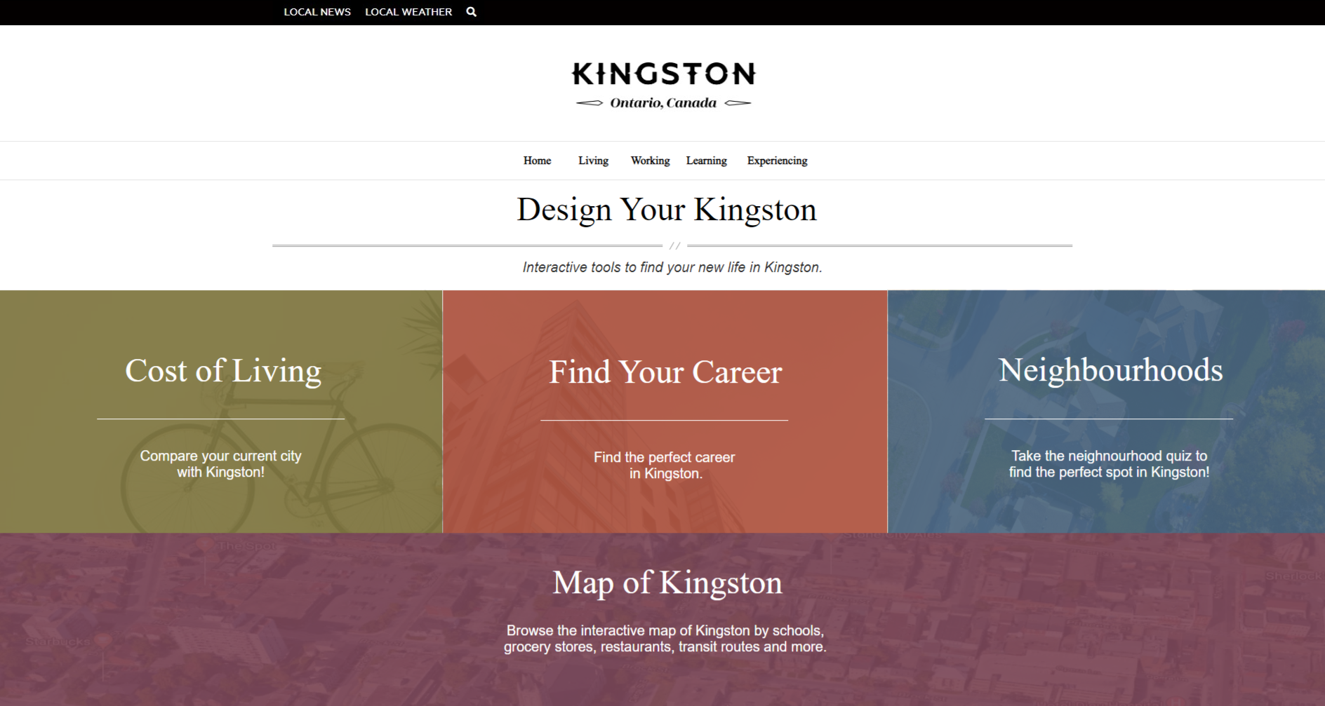
Home Page
Add visual interest to the site. In our second usability test, which ran on the website, our participants said they wanted to see more colour as it looked dull before. We added four accessible brand-specific colours to the home page and carried them throughout the tool to accomplish this.
Cost of Living Tool
Integrate the input and results screen for easier navigation. In the usability test, users who were tasked with comparing more than one city had a difficult time because the only compare button was at the bottom of the page.
Adjust form inputs for best practices. This means adjusting the length of the fields to give more context as to what information should be input. Bold labels, and change a drop-down to radio buttons.
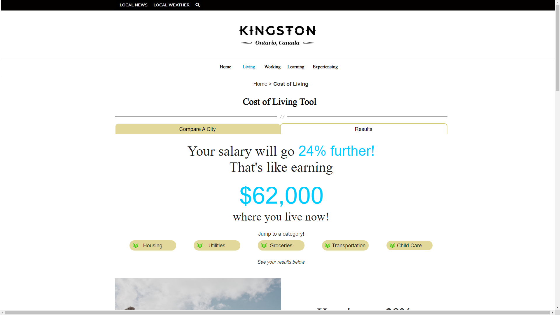
Cost of Living - Results Screen
Show all main comparisons on the results screen. The competitive scan showed that users should see all main comparisons first and give them the option to choose which detailed information to see first.